Discover 12 best living room color schemes for 2026 that look genuinely designer-approved. Real paint names, real pairings, real reasons they work.
There is a specific moment that happens in every designer-approved living room — you walk in and before you’ve registered a single piece of furniture, you’ve already felt something. Calm. Warmth. Quiet confidence. That feeling comes almost entirely from color, and it happens before your brain even catches up to consciously notice it.
Here is what separates a living room color scheme that looks designed from one that looks accidental: it is never about finding “the right color.” It is about choosing a base tone, a secondary tone, and an accent that genuinely speak to each other — and then having the confidence to commit instead of playing it safe with whatever beige happened to be on sale.
2026 has brought a clear shift away from the stark whites and cool grays that dominated the last decade, toward warmer, earthier, more nuanced palettes that designers describe as “quietly colorful.” This guide covers 12 specific living room color schemes, the exact paint names designers are using, and the decor pairings that make each palette work.
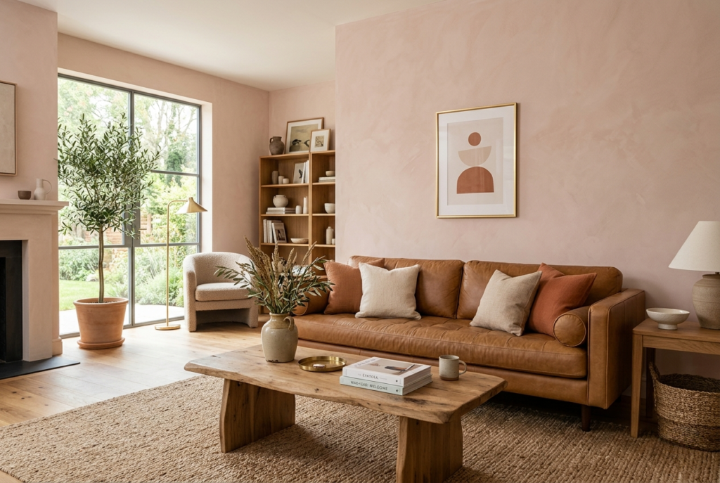
1. Warm White And Caramel Leather {#warm-white-caramel}
Best Paint: Sherwin-Williams Alabaster or Benjamin Moore Seapearl Best For: Open-concept living rooms, spaces with abundant natural light
This is the combination that keeps appearing on every design board for a reason — it simply works. A neutral ivory backdrop paired with caramel leather seating creates a living room that feels both collected and effortless at the same time. The warmth of the leather keeps the space from reading cold or sterile, while the light walls allow natural sunlight to bounce around the room throughout the day.
What makes this scheme genuinely 2026 rather than the bright-white-and-gray of the last decade is the specific warmth in the white itself. Sherwin-Williams Alabaster and Benjamin Moore Seapearl both lean warm rather than stark, adapting beautifully to different lighting conditions and creating a calm foundation without reading cold. This scheme is especially popular in open-concept homes where the living area flows into the kitchen, giving the whole floor a unified, expansive feeling.
Layer in natural materials — a jute or wool rug, linen throw pillows, a wood coffee table — and the palette gains the textural depth that keeps warm white from feeling flat or boring.
Pairs Beautifully With:
- Caramel or cognac leather sofa or accent chair
- Natural jute or wool rug
- Brass or warm gold hardware and light fixtures
- Linen throw pillows in cream or soft clay
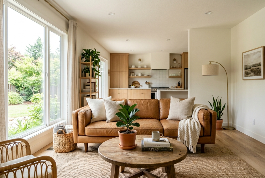
2. Plaster Pink And Natural Wood {#plaster-pink}
Best Paint: Farrow and Ball Dead Salmon Best For: Living rooms wanting warmth and personality without overwhelming color
Plaster pinks are one of the defining warm color trends for 2026 living rooms — adding more color than a traditional neutral, but with a muddy, dusky quality that feels sophisticated and genuinely easy to live with day to day. Farrow and Ball’s Dead Salmon specifically has become a favorite among designers for feeling unexpected yet still functioning as a neutral, with its soft blend of pink, brown, and earth tones adding warmth without overwhelming a space.
This color pairs beautifully with natural materials — wood, linen, and stone — giving the room a relaxed, collected feeling rather than a precious or overly feminine one. It is an ideal choice for anyone wanting genuine character and depth in their living room while keeping the space highly livable for actual daily use.
The key to making plaster pink read as sophisticated rather than sweet: pair it with materials that have weight and texture. A substantial wood coffee table, a stone side table, or a heavy linen sofa keep the palette grounded.
Pairs Beautifully With:
- Natural oak or walnut furniture
- Stone or concrete decorative accents
- Heavy linen upholstery in cream or warm taupe
- Brass picture frames and light fixtures
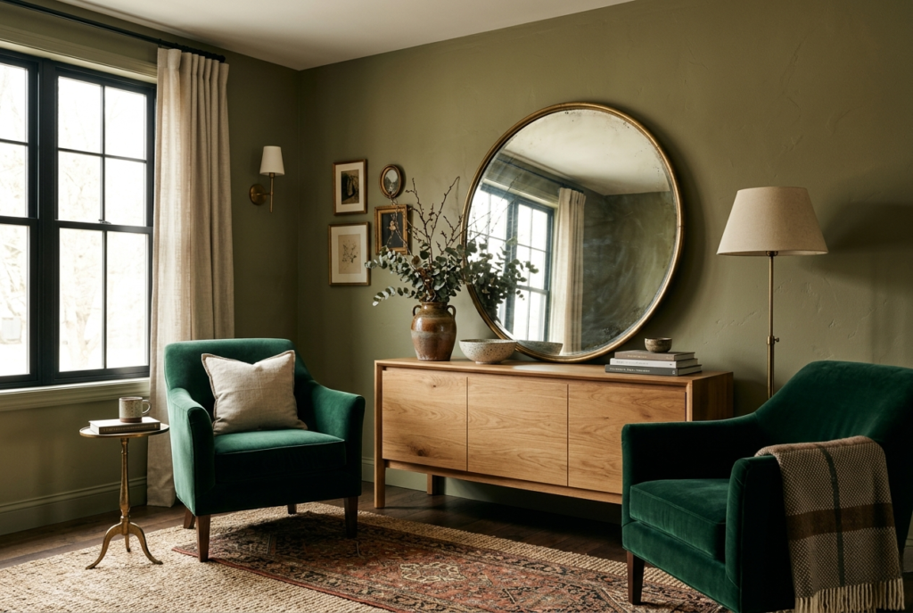
3. Olive Green And Brass {#olive-green}
Best Paint: Any rich, yellow-undertone olive green Best For: Cozy living rooms wanting a grounding neutral with personality
Olive green has yellow undertones that add warmth and complexity, playing directly into the cozy aesthetic that has dominated 2026 living room design. Multiple designers have named it their top pick for the year specifically because it solves a genuine design problem: it is a grounding neutral that isn’t boring. The warm undertones keep it feeling gentle and inviting despite being a mid-tone shade, and it plays well with an unusually wide range of other colors.
This is also one of the most seasonally versatile color choices available — cozy and enveloping in winter, while coming genuinely alive in spring and fall when paired with the right natural light. Olive walls combined with velvet armchairs and warm wood tones create a look that designers describe as “green done the grown-up way” — classic without feeling stuck in the past.
An antique mirror and a rich brown console table layer in old-world charm, while keeping the arrangement symmetrical and considered keeps the whole scheme feeling sharp and collected rather than cluttered.
Pairs Beautifully With:
- Velvet armchairs in deep jewel tones
- Warm walnut or mahogany wood furniture
- Antique or vintage brass mirrors
- Brass or aged gold light fixtures
4. Mushroom Brown And Cream {#mushroom-brown}
Best Paint: Any organic mushroom brown shade Best For: Living rooms wanting an updated alternative to millennial gray
If you want a neutral that’s a little more unique than cream alone, mushroom brown has become one of the most recommended 2026 living room colors precisely because it functions as an updated, stylish alternative to the millennial gray that dominated the previous decade. This organic, botanical shade is naturally restful, making it a genuinely versatile base for almost any modern living room style.
The flexibility of mushroom brown is part of what makes it such a strong pick. Lighten the space up with soft cream fabrics and lush green accessories for an airier, brighter feeling, or lean into richer brown tones throughout the rest of the room to deepen and warm the space further. Either direction works, which makes this color scheme genuinely adaptable as your taste or your furniture collection evolves over time.
For the most current 2026 execution, keep the cream elements warm rather than cool — warm ivory bedding-style textiles, natural unbleached cotton, and warm white trim all work together with mushroom brown walls far better than anything with a blue or gray undertone.
Pairs Beautifully With:
- Soft cream linen or cotton upholstery
- Lush green plants and botanical accents
- Warm wood flooring or furniture
- Woven natural fiber rugs and baskets
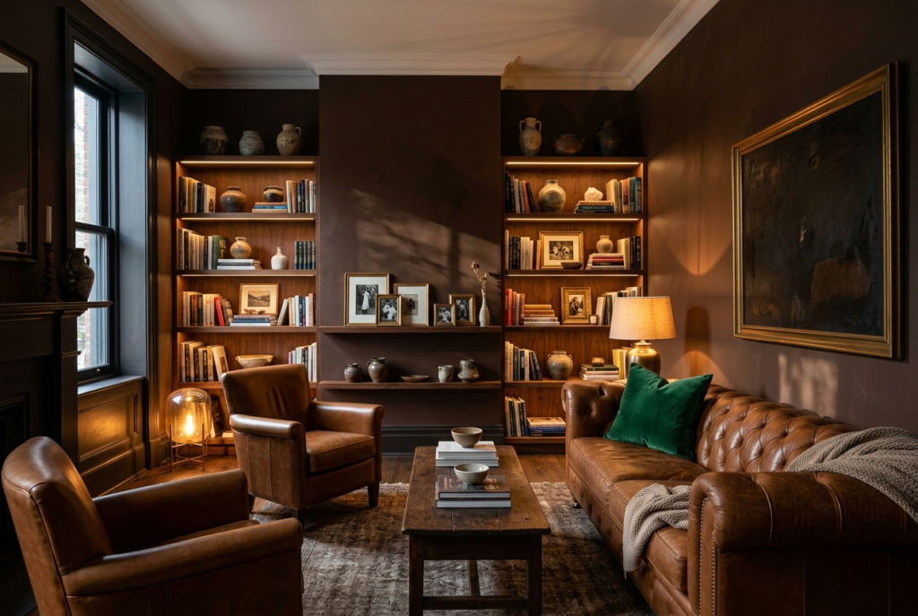
5. Deep Chocolate And Charcoal {#deep-chocolate}
Best Paint: Benjamin Moore Silhouette (2026 Color of the Year) Best For: Living rooms wanting drama, depth, and sophistication
Benjamin Moore’s Color of the Year for 2026, Silhouette, offers a rich, deep chocolatey tone with subtle charcoal undertones that can anchor a remarkably wide variety of interior styles, creating genuine depth and sophistication wherever it’s used. This is not a color that plays it safe — and that confidence is exactly the point.
What makes deep chocolate work so well in 2026 specifically is its versatility as both a backdrop and a contrasting element. It works beautifully as a fully color-drenched wall treatment behind lighter, textured furniture, allowing every piece to stand out dramatically against the dark backdrop. It works equally well in smaller doses — a single accent wall, painted cabinetry, or a deep brown sofa against lighter walls — for those wanting the depth without committing an entire room.
Dark walls are not the safe choice, but they are not the risky choice either anymore. As one designer put it, dark walls aren’t scary, they’re just confident. Pair deep chocolate with warm leather, rich wood shelving, and at least one jewel-toned accent piece to keep the scheme feeling intentional rather than simply dark.
Pairs Beautifully With:
- Warm cognac or caramel leather seating
- Rich wood open shelving
- Jewel-toned accent pieces — emerald, rust, or deep gold
- Brass or warm gold picture frames and hardware
6. Terracotta And Warm Neutrals {#terracotta}
Best Paint: Any warm, muted terracotta shade Best For: Living rooms wanting personality with a grounded, organic feel
Earth-toned paint colors are one of the major trends defining 2026, with some designers even suggesting earth tones are becoming considered neutrals this year due to how essential they have become in home design. Terracotta specifically is a striking way to inject a living room with color while keeping the space genuinely grounded and organic rather than loud.
As a warm yet muted shade, terracotta pairs beautifully with minimalist, rustic, and nature-inspired aesthetics — it has a versatility that brighter, more saturated oranges simply don’t have. The key to making terracotta feel current rather than dated (avoiding any association with 1970s orange) is keeping the surrounding palette warm and neutral rather than competing with additional bold colors.
This scheme works exceptionally well as an accent wall behind a neutral sofa, or as the dominant color in smaller doses through pottery, textiles, and accent furniture rather than covering every wall. Terracotta has the rare quality of looking equally good as a confident full-room commitment or a restrained single accent.
Pairs Beautifully With:
- Natural linen sofas in warm cream or oatmeal
- Woven rattan or wicker furniture
- Stoneware and ceramic decor pieces
- Warm wood tones throughout
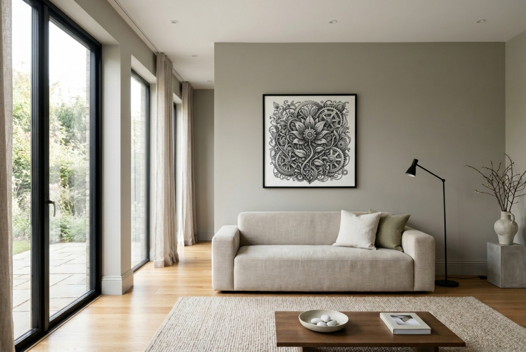
7. Cool Greige Minimalist {#cool-greige}
Best Paint: Any cool-leaning greige shade Best For: Modern minimalist living rooms with abundant natural light
Greige — the perfect marriage of gray and beige — remains a workhorse living room wall color, but in 2026, the cool-leaning version specifically is having its moment. While warm greige dominated for the past several years, the cooler take feels fresher and more current, particularly in interior schemes that lean toward clean-lined minimalism.
This particular palette functions almost like a deep breath in color form — calming, uncluttered, and quietly sophisticated. Cool greige works best in newer construction homes with abundant natural light and open floor plans, common in developments with large windows and high ceilings where warmer colors can sometimes feel washed out under strong daylight. A cool greige holds its sophistication even in that much light.
This is also an excellent choice for condos and townhomes where the living room shares sightlines with an open kitchen — the neutrality of cool greige ties everything together without forcing a single dominant color choice across multiple connected spaces.
Pairs Beautifully With:
- Clean-lined contemporary furniture
- Simple, minimal art in black or white frames
- Matte black or brushed nickel hardware
- Minimal, uncluttered styling with negative space
8. Sage Green And Warm Wood {#sage-green}
Best Paint: Any soft, muted sage green Best For: Living rooms wanting a calm, universally flattering neutral-green
Sage green is a popular shade for an obvious reason — it is chic without being overstated, and it fits a remarkably wide range of living room styles. Sage works beautifully with nearly any accent color you can imagine, making it one of the lowest-risk, highest-reward color choices available for a 2026 living room. Even paint brands’ actual Colors of the Year for 2026 lean into sage-adjacent, warm green territory, reflecting just how broadly this color category has been embraced.
Whether you choose sage as a single accent wall or commit to drenching the entire living room in this soothing shade, it is genuinely difficult to make a poor choice with this color family. The forgiving, calming nature of sage green makes it particularly well suited to living rooms used for relaxation and downtime rather than high-energy entertaining.
Pair sage with warm wood tones rather than cool grays or whites to keep the scheme feeling current and grounded — the warmth of natural wood prevents sage from reading as cold or sterile, which is the most common mistake people make with green living room walls.
Pairs Beautifully With:
- Warm natural wood furniture and flooring
- Cream and oatmeal textiles
- Brass or warm gold accents
- Botanical prints and real or faux plants
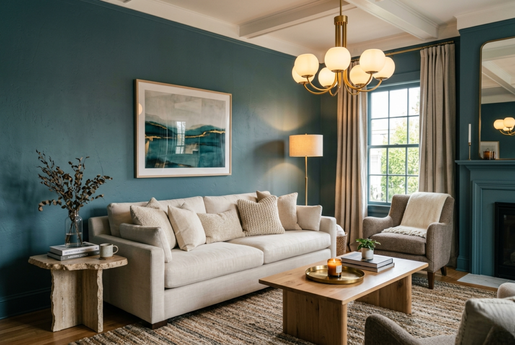
9. Muted Teal And Brass {#muted-teal}
Best Paint: Any deep, muted blue-green teal Best For: Living rooms wanting bold color without sacrificing sophistication
If you want to add genuine color to your living room in 2026 without it feeling juvenile or fleeting, teal — the blue-green hybrid — manages to feel calming and bold at the same time, reading as considerably more current than the dark forest greens or navy blues of recent years. It occupies a genuinely unique position in the color wheel that few other shades can claim.
This scheme works particularly well for living rooms wanting a statement color that still functions as a backdrop for furniture and art rather than competing with it. Muted, deeper teals specifically — rather than bright, saturated turquoise — read as sophisticated and grounded rather than trendy or temporary, which matters significantly if you’re choosing a color you want to live with for several years.
Brass and warm gold accents are an essential pairing with teal specifically — the warmth of the metal counteracts any coolness in the blue-green tone and keeps the overall scheme feeling balanced rather than cold.
Pairs Beautifully With:
- Brass or warm gold light fixtures and hardware
- Cream or ivory upholstered furniture
- Wool and linen textured pillow covers
- Natural stone or wood accent pieces
10. Espresso Brown And Gold {#espresso-brown}
Best Paint: Deep espresso or “espresso martini” brown Best For: Living rooms wanting bold, rich color that doesn’t read as trendy
As homeowners look to add personality to their living rooms without going overboard, designers are increasingly recommending shades that are bold but not too bold — and a deep, rich espresso brown achieves exactly that balance. Some designers have begun re-coining this shade as “espresso martini,” reflecting just how timeless this color has become within current design trends.
Espresso brown makes a living room stand out without overwhelming the senses, functioning almost like the new version of what navy blue accomplished for the previous decade — a deep, confident neutral that anchors a room without demanding constant attention. It pairs particularly well with warm metallics and natural materials that prevent the deep brown from reading as heavy or oppressive.
For the most current 2026 execution of this scheme, avoid pairing espresso brown with cool grays or stark whites — the contrast reads as dated rather than sophisticated. Stick to warm creams, golds, and natural wood tones throughout the rest of the room.
Pairs Beautifully With:
- Warm gold or brass decorative accents
- Cream and ivory textiles
- Natural wood furniture in a lighter tone for contrast
- Warm-toned area rugs in cream or caramel
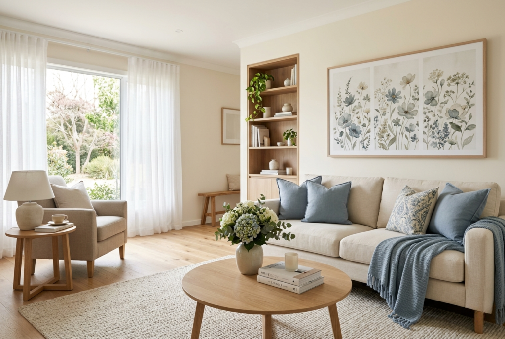
11. Cream And Dusty Blue {#cream-dusty-blue}
Best Paint: Warm cream base with dusty blue accents Best For: Living rooms wanting a light, airy, gently colorful feel
This palette stays firmly in the light and airy lane, but soft dusty blue accents add just enough contrast to keep the space genuinely interesting rather than flat. A neutral cream sofa anchors the room, while layered textiles in dusty blue tones keep the overall scheme from feeling plain or under-decorated.
This is a strong reminder that a living room does not need bold, saturated color to feel intentional and designed. Sometimes the most effective approach is choosing gentle, complementary tones that genuinely play well together and then letting the space breathe with appropriate negative space and texture rather than visual noise.
This scheme works particularly well for living rooms that double as more formal entertaining spaces, since the lightness and softness read as elegant and welcoming without the heaviness that bolder color schemes can sometimes bring to formal occasions.
Pairs Beautifully With:
- Dusty blue throw pillows and accent textiles
- Cream or warm white upholstered furniture
- Light wood furniture and flooring
- Soft floral or botanical art in muted tones
12. Color Drenched Jewel Tone {#color-drenched}
Best Paint: Any rich jewel tone — emerald, sapphire, or garnet — used wall to ceiling to trim Best For: Living rooms wanting maximum drama and a fully immersive feel
Color drenching — painting walls, trim, ceiling, and sometimes even built-in cabinetry all in the same rich color — has become one of the most distinctive 2026 living room trends precisely because it creates a cocooning, sophisticated feeling that a single accent wall simply cannot replicate. In an open-plan space, fully color-drenching a living or lounge area creates the perfect backdrop for carefully collected artwork and furniture, allowing each individual piece to genuinely shine against the immersive color.
This approach works particularly well when paired with a contrasting tone on adjacent surfaces like cabinet interiors or built-in shelving — the contrast adds depth and gives joinery a real sense of dimension while helping frame a mix of modern and vintage furniture pieces in a way that feels intentional and layered rather than overly styled.
Color drenching is not a subtle commitment, and it is not meant to be. But the resulting room reads as confident, curated, and genuinely memorable in a way that more cautious color choices rarely achieve.
Pairs Beautifully With:
- A contrasting tone on cabinet interiors or shelving backs
- Vintage and modern furniture mixed deliberately
- Gold or brass picture frames and hardware
- Curated, carefully chosen art and objects rather than abundant decor
How To Layer A Color Scheme So It Looks Collected, Not Catalog-Perfect
Choosing the right base color is only the first step. The living rooms that read as genuinely designer-approved share one additional quality: intentional variation rather than perfect matching.
When every pink element is the exact same shade and every gray piece lines up perfectly, a room starts to look like a staged furniture showroom rather than someone’s actual home. The fix is deliberate variation — a slightly warmer tone on the walls, a slightly cooler version of the same color family in the pillows, and a sofa that leans one direction while the rug leans another.
Let the tones drift a little. That gentle imperfection is precisely what makes a color palette feel lived-in and personal instead of copy-pasted from a catalog. This is true regardless of which of the twelve schemes above you choose — building in small, intentional variation within your chosen color family is what separates a room that looks designed from one that simply looks coordinated.
Expert Perspective — Why “Quietly Colorful” Is Winning In 2026
Here is the underlying shift that explains every single trend in this guide.
For years, living room color advice split into two unhelpful camps: play it completely safe with neutral beige and gray, or go fully bold with saturated, attention-seeking color. 2026 has revealed a third option that designers are now calling “quietly colorful” — subtle, comforting hues that feel genuinely fresh without demanding attention.
This is not a compromise between bold and boring. It is a more sophisticated approach entirely. Plaster pink, olive green, mushroom brown, and muted terracotta all have actual color and personality, but they are muted and earthy enough to feel calm and livable rather than performative. They photograph beautifully without screaming for attention, and they age gracefully rather than looking dated within a year or two.
The living rooms that will still look current in five years are not the boldest ones or the safest ones — they are the ones using this quietly colorful approach, where the color choice feels like a genuine decision rather than either a trend chase or a fear of commitment.
Frequently Asked Questions
Q: What is the most popular living room color for 2026? There is no single dominant color, but warm, earthy neutrals and muted greens — particularly olive green, mushroom brown, and plaster pink — are the most consistently recommended choices across multiple major design sources for 2026. The unifying theme is warmth and quiet sophistication rather than any single specific shade.
Q: Are gray living rooms going out of style in 2026? Cool-toned, stark grays are genuinely falling out of favor, with designers specifically warning against icy grays and blue-based whites that can feel flat and lifeless. Warmer, softer interpretations of gray — like cool greige — remain popular, particularly in minimalist or contemporary spaces with abundant natural light.
Q: What colors pair well with a neutral beige living room? Beige pairs exceptionally well with caramel leather, brass or warm gold accents, deep jewel tones used sparingly, and natural materials like wood, jute, and linen. The key is choosing a warm rather than cool beige as your base, since warm beige provides a more flattering foundation for almost every accent color.
Q: How do I choose a living room color scheme without it looking dated in a few years? Choose muted, earthy versions of colors rather than bright, saturated ones — muted olive rather than bright kelly green, terracotta rather than bright orange, plaster pink rather than bubblegum pink. These muted, nuanced tones consistently age better than highly saturated trend colors because they read as intentional choices rather than passing fads.
Q: Can I mix warm and cool tones in the same living room color scheme? Generally it is best to commit primarily to either warm or cool undertones throughout a room, since mixing them inconsistently is one of the most common reasons a color scheme feels off without anyone being able to identify exactly why. If you want variation, vary the saturation and depth within your chosen temperature rather than crossing between warm and cool.
Conclusion
A living room color scheme that looks designer-approved is not about finding a secret, exclusive color nobody else knows about. It is about choosing a genuine direction — warm or cool, bold or quiet — and committing to it with intention rather than playing it safe with whatever feels easiest.
The twelve schemes in this guide represent the strongest, most current directions for 2026 specifically. Pick the one that matches how you actually want to feel in your living room, layer it with the pairings suggested, and allow a little intentional imperfection in the details. That combination is what separates a room that looks collected from one that looks accidental.